Creating engaging user experiences with descriptive language
Upgrading product analytics
Product
Heyday by Hootsuite is a multilingual AI chatbot for retailers that helps them support their customers and manage different conversations in one place.
My role
As a UX Writer I:
Led the content design strategy to guide the overall project direction
Ran a content audit.
Crafted clear, engaging content to ensure a cohesive user experience
My team
I worked on this project along with:
Analytics engineer
Head of product
Project goals
This project ultimately aims to transform the Insights section into a more intuitive, informative, and user-centered experience that meets the needs of a broadening audience.
User research and customer service feedback have highlighted that clients often face challenges with the Insights section, particularly in understanding how data is measured and what specific metrics represent. These issues stem from inconsistencies and gaps in the copy, leading to confusion and making it harder for users to extract meaningful insights. To address this, this project is focused on:
Improving clarity: Revamping the copy on the Insights page to make metrics, measurement methods, and definitions clear and accessible, minimizing any potential for misinterpretation.
Standardizing terminology: Creating consistency in the language used across the section, so that similar concepts are referred to in a unified way, reducing ambiguity.
Aligning with user contexts: As our client base grows, adapting our terminology and explanations to better reflect the diverse backgrounds and needs of different user segments.
Methodology
I used the following methods to improve the user experience:
Content analysis
Process flow diagram
Call listening analysis
Market analysis
Call listening analysis
Considering that I didn’t have the resources to conduct user interviews, I used Gong to get as close as I can to raw user feedback.
I filtered calls and focused on the ones that mentioned ‘insights’ ‘analytics’ ‘data’ and ‘metrics.’ I was able to find some calls that allowed to pin points some areas in the insight page that needed clarification.
I was also able to identify the type of questions users have in mind when looking at the metrics, such as:
what can I do to solve poor metrics?
What’s the start time and end time for this data?
What the term refers to and how it's measured?
Content analysis
I then started to take a closer look at the content.
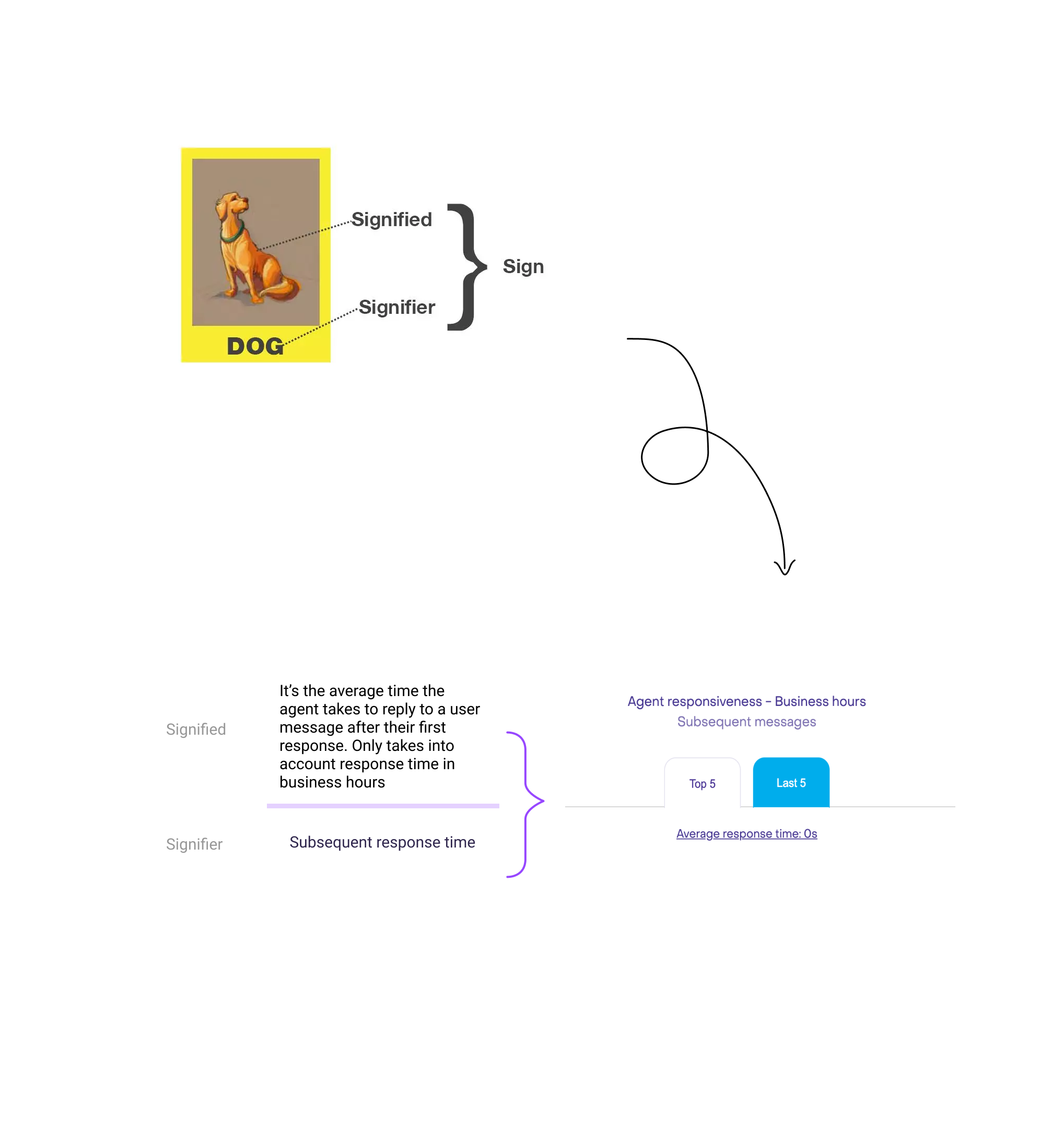
I used the semiotic method to examine if the current copy refers to the correct concepts, and if we are offering users enough explanation to understand the charts, and if we are adopting the proper voice and tone.
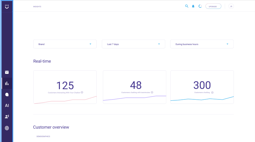
I started off by documenting all the content in the Insights page. then I verified with our analytics engineer how each section is being measured.
For example, this chart doesn’t explain what subsequent messages are referring to. So this exercise allowed me to understand the calculation behind the charts and define what is the signifier which ended being the title I use to the charts and the Signifier which is the definition I added to the tooltips.
Process flow diagram
I noticed that there were some concepts that the team was explaining using different terms and metrics which wasn’t leading to a shared understanding of that concept. to solve this issue, I relied on creating some process flow diagrams to help create a shared understanding
The metrics related to response time and wait time were creating a lot of confusion internally and for the users. so I decided to map them out to ensure comprehension. The diagrams were appreciated by the help center team and decided to implement them in their documentation.
Market analysis
Different platforms that our clients are probably using were consulted to examine how they present their charts and the vocabulary they use.
Defining goals
What now?
From this research, I was able to start defining clear goals to help guide me through my creation.
User goal
As a team admin, I want to easily understand the data so I can make actionable decisions to improve my team’s performance.
Business goal
Strengthen team admins' trust in Heyday as a reliable tool for evaluating business and team performance.
New content
Before
After
After meeting with the Analytics team, we realized that the ‘Total’ label is incorrect, and should be non-engaged instead. Second, this chart needed a title that shows both metrics being used in the calculation so I decided to use the cross-tabulation metric to illustrate that and provided additional information in the tooltip.
Before
After
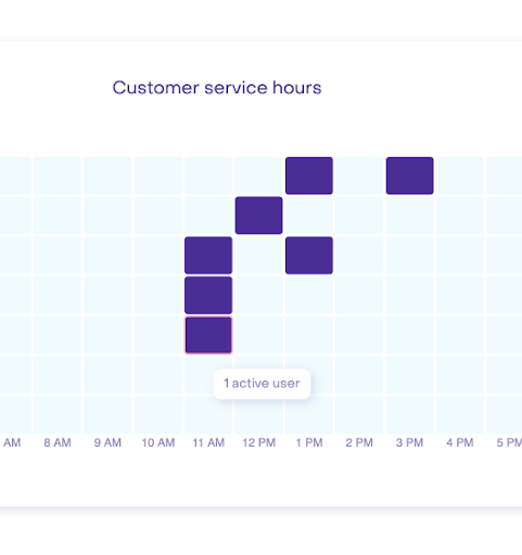
The title Customer service hours doesn't say much to the user about the value this chart brings.
Before
After
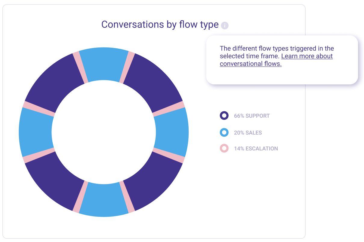
This chart indicates the number of conversations, not just the flow type. We needed to reflect that in the title.
Before
After
Many of our users had questions about the calculation of the subsequent reply time. Therefore we added a tooltip to help them understand.
Full prototype
Results
We did a usability test to validate the new content with existing customers. I received great feedback from users saying that the new content is very helpful and that now they can better understand the charts.
Customer success folks also reported a decrease in calls related to the Insight page.


